Monday, October 31, 2016

...and then a miracle happens (or two or three)


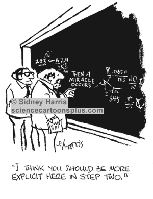
Many of you will be familiar with this cartoon, used in many texts on the use of Theories of Change
If you look at diagrammatic versions of Theories of Change you will see two type of graphic elements: nodes and links between the nodes. Nodes are always annotated, describing what is happening at this point in the process of change. But the links between nodes are typically not annotated with any explanatory text. Occasionally (10% of the time in the first 300 pages of Funnell and Rogers book on Purposeful Program Theory) the links might be of different types e.g. thick versus thin lines or dotted versus continuous lines. The links tell us there is a causal connection but rarely do they tell us what kind of causal connection is at work. In that respect the point of Sidney Harris's cartoon applies to a large majority of graphic representations of Theories of Change.

In fact there are two type of gaps that should be of concern. One is the nature of individual links between nodes. The other is how a given set of links converging on a node work as a group, or not, as it may be. Here is an example from the USAID Learning Lab web page. Look at the brown node in the centre, influenced by six other green events below it

 In this part of the diagram there are a number of possible ways of interpreting the causal relationships between the six green events underneath the brown event they all connect to:

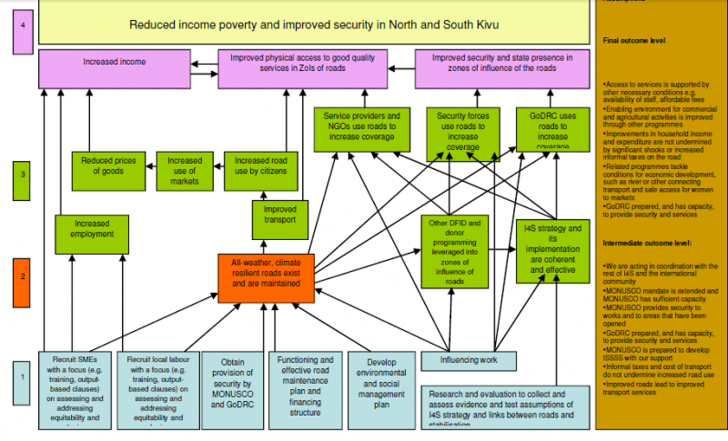
The first set are binary possibilities, where the events are or are not important:

1. Some or all of these events are necessary for the brown event to occur.
2. Some of all of the events are sufficient for the brown event to occur
3. None of the events are necessary or sufficient but two or more of combinations of these are sufficient

The fourth is more continuous
4. The more of these events that are present (and the more of each of these) the more the brown event will be present
5. The relationship may not be linear, but exponential or s-shaped or more complex polynomial shapes (likely if there are feedback loops present)

These various possibilities have different implications for how this bit of the Theory of Change could be evaluated. Necessary or sufficient individual events will be relatively easy to test for. Finding combinations that are necessary or sufficient will be more challenging, because there potential many (2^5=32 in the above case). Likewise finding linear and other kinds of continuous relationships would require more sophisticated measurement. Michael Woolcock (2009) has written on the importance of thinking through what kinds of impact trajectories our various contextualised Theories of Change might suggest we will find in this area.

Of course the gaps I have pointed out are only one part of the larger graphic Theory of Change shown above. The brown event is itself only one of a number of inputs into other events shown further above, where the same question arises about how they variously combine.

So, it turns out that Sydney Harris's cartoon is really a gentle understatement of how much more we really need to specify before we can have an evaluable Theory of Change on our hands.

Tuesday, August 09, 2016

Three ways of thinking about linearity


Describing change in "linear" terms is seen as bad form these days. But what does this term linear mean? Or perhaps more usefully, what could it mean?

In its simplest sense it just means one thing happening after another, as in a Theory of Change that describes an Activity leading to an Output leading to an Outcome leading to an Impact. Until time machines are invented, we can't escape from this form of linearity.

Another perspective on linearity is captured by Michael Woolcock's 2009 paper on different kinds of impact trajectories. One of these is linear, where for every x increase in an output there is a y increase in impact. In a graph plotting outputs against impacts, the relationship appears as a straight line. Woolcock's point was that there are many other shaped relationships that can be seen in different development projects. Some might be upwardly curving, reflecting an exponential growth arising from the existence of some form of feedback loop, whereby increased impact facilitates increased outputs. Others may be must less ordered in their appearance as various contending social forces magnify and moderate a project's output to impact relationship, with the balance of their influences changing over time. Woolcock's main point, if I recall correctly, was that any attempt to analyse a project's impact has to give some thought to the expected shape of the impact trajectory, before it plans to collect and analyse evidence about the scale of impact and its causes.

The third perspective on linearity comes from computer and software design.Here the contrast is made between linear and parallel processing of data. With linear processing, all tasks are undertaken somewhere within a single sequence. With parallel processing many tasks are being undertaken at the same time, within different serial processes. The process of evolution is a classic example of parallel processing. Each organism in its interactions with its environment is testing out the viability of a new variant in the species' genome. In development projects parallel processing is also endemic, in the form of different communities receiving different packages of assistance, and then making different uses of those packages, with resulting differences in the outcomes they experience.

In evaluation oriented discussion of complexity thinking a lot of attention is given to unpredictability, arising from the non-linear nature of change over time, of the kind described by Woolcock. But it is important to note that there are various identifiable forms of change trajectories that lie in between simple linear trajectories and chaotic unpredictable trajectories. Evaluation planning needs to think carefully about the whole continuum of possibilities here.

The complexity discussion gives much less attention to the third view of non-linearity, where diversity is the most notable feature. Diversity can arise from both intentional and planned differences in project interventions but also from unplanned or unexpected responses to what may have been planned as standardized interventions. My experience suggests that all too often assumptions are made, at least tacitly, that interventions have been delivered in a standardized manner. If instead the default assumption was heterogeneity, then evaluation plans would need to spell out how this heterogeneity would be dealt with. If this is done then evaluations might become more effective in identifying "what works in what circumstances", including identifying localized innovations that had potential for wider application.


Saturday, July 16, 2016

EvalC3 - an Excel-based package of tools for exploring and evaluating complex causal configurations


Over the last few years I have been exposed to two different approaches to identifying and evaluating complex causal configurations within sets of data describing the attributes of projects and their outcomes. One is Qualitative Comparative Analysis (QCA) and the other is Predictive Analytics (and particularly Decision Tree algorithms). Both can work with binary data, which is easier to access than numerical data, but both require specialist software - which requires time and effort to learn how to use

In the last year I have spent some time and money, in association with a software company called Aptivate (Mark Skipper in particular) developing an Excel based package which will do many of the things that both of the above software packages can do, as well as provide some additional capacities that neither have.

This is called EvalC3, and is now available [free] to people who are interested to test it out, either using their own data and/or some example data sets that are available. The "manual" on how to use EvalC3 is a supporting website of the same name, found here: https://evalc3.net/  There is also a  short introductory video here.

Its purpose is to enable users: (a) to identify sets of project & context attributes which are  good predictors of the achievement of an outcome of interest,  (b) to compare and evaluate the performance of these predictive models, and (c) to identify relevant cases for follow-up within-case investigations to uncover any causal mechanisms at work.

The overall approach is based on the view that “association is a necessary but insufficient basis for a strong claim about causation, which is a more useful perspective than simply saying “correlation does not equal causation”.While the process involves systematic quantitative cross-case comparisons, its use should be informed by  within-case knowledge at both the pre-analysis planning and post-analysis interpretation stages.

The EvalC3 tools are organised in a work flow as shown below:


The selling points:


  • EvalC3 is free, and distributed under a Creative Commons Attribution-NonCommercial-ShareAlike 4.0 International License.
  • It uses Excel, which many people already have and know how to use
  • It uses binary data. Numerical data can be converted to binary but not the other way
  • It combines manual hypothesis testing with  algorithm based (i.e. automated) searches for good performing predictive models
  • There are four different algorithms that can be used
  • Prediction models can be saved and compared
  • There are case-selection strategies for follow-up case-comparisons to identify any casual mechanisms at work "underneath" the prediction models

If you would like to try using EvalC3 email rick.davies at gmail.com

Skype video support can be provided in some instances. i.e. if your application is of interest to me :-)

Monday, March 07, 2016

Why I am sick of (some) Evaluation Questions!


[Beginning of rant] Evaluation questions are are a cop out, and not only that, they are an expensive cop out. Donors commissioning evaluations should not be posing lists of sundry open ended questions about how their funded activities are working and or having an impact.

They should have at least some idea of what is working (or not) and they should be able to  articulate these ideas. Not only that, they should be willing, and even obliged, to use evaluations to test those claims. These guys are spending public monies, and the public hopefully expects that they have some idea about what they are doing i.e. what works. [voice of inner skeptic: they are constantly rotated through different jobs, so probably don't have much idea about what is working, at all]

If open ended evaluation questions were replaced by specific claims or hypotheses then evaluation efforts could be much more focused and in-depth, rather than broad ranging and shallow. And then we might have some progress in the accumulation of knowledge about what works.

The use of swathes of open ended evaluation questions also relates to the subject of institutional memory about what has worked in the past. The use of open ended questions suggests little has been retained from the past, OR is now deemed to be of any value. Alas and alack, all is lost, either way [end of rant]

Background: I am reviewing yet another inception report, which includes a lot of discussion about how evaluation questions will be developed. Some example questions being considered:
How can we value ecosystem goods and services and biodiversity?  

How does capacity building for better climate risk management at the institutional level
translate into positive changes in resilience

What are the links between protected/improved livelihoods and the resilience of people and communities, and what are the limits to livelihood-based approaches to improving resilience?