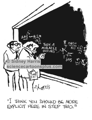
Many of you will be familiar with this cartoon, used in many texts on the use of Theories of Change
If you look at diagrammatic versions of Theories of Change you will see two type of graphic elements: nodes and links between the nodes. Nodes are always annotated, describing what is happening at this point in the process of change. But the links between nodes are typically not annotated with any explanatory text. Occasionally (10% of the time in the first 300 pages of Funnell and Rogers book on Purposeful Program Theory) the links might be of different types e.g. thick versus thin lines or dotted versus continuous lines. The links tell us there is a causal connection but rarely do they tell us what kind of causal connection is at work. In that respect the point of Sidney Harris's cartoon applies to a large majority of graphic representations of Theories of Change.
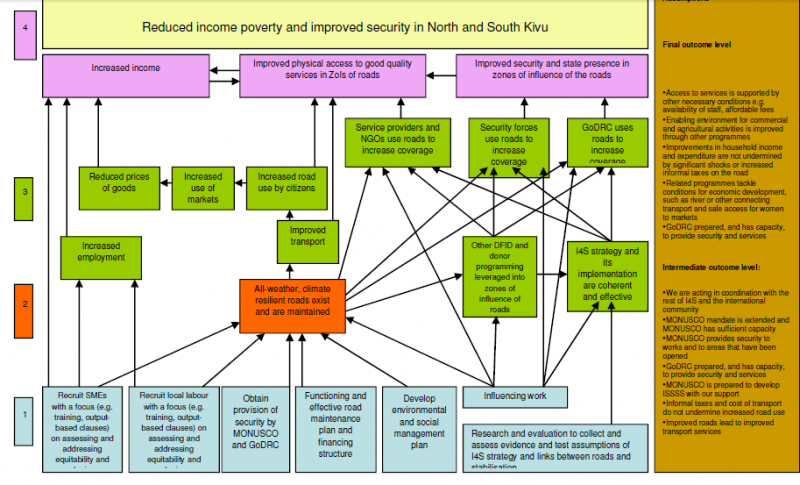
In fact there are two type of gaps that should be of concern. One is the nature of individual links between nodes. The other is how a given set of links converging on a node work as a group, or not, as it may be. Here is an example from the USAID Learning Lab web page. Look at the brown node in the centre, influenced by six other green events below it
In this part of the diagram there are a number of possible ways of interpreting the causal relationships between the six green events underneath the brown event they all connect to:
The first set are binary possibilities, where the events are or are not important:
1. Some or all of these events are necessary for the brown event to occur.
2. Some of all of the events are sufficient for the brown event to occur
3. None of the events are necessary or sufficient but two or more of combinations of these are sufficient
The fourth is more continuous
4. The more of these events that are present (and the more of each of these) the more the brown event will be present
5. The relationship may not be linear, but exponential or s-shaped or more complex polynomial shapes (likely if there are feedback loops present)
These various possibilities have different implications for how this bit of the Theory of Change could be evaluated. Necessary or sufficient individual events will be relatively easy to test for. Finding combinations that are necessary or sufficient will be more challenging, because there potential many (2^5=32 in the above case). Likewise finding linear and other kinds of continuous relationships would require more sophisticated measurement. Michael Woolcock (2009) has written on the importance of thinking through what kinds of impact trajectories our various contextualised Theories of Change might suggest we will find in this area.
Of course the gaps I have pointed out are only one part of the larger graphic Theory of Change shown above. The brown event is itself only one of a number of inputs into other events shown further above, where the same question arises about how they variously combine.
So, it turns out that Sydney Harris's cartoon is really a gentle understatement of how much more we really need to specify before we can have an evaluable Theory of Change on our hands.


No comments:
Post a Comment