Saturday, March 09, 2019

On using clustering algorithms to help with sampling decisions


I have spent the last two days in a training workshop run by BigML, a company that provides very impressive, coding-free, online machine learning services. One of the sessions was on the use of clustering algorithms, an area I have some interest in, but have not done much with, over the last year or so. The whole two days were very much centered around data and the kinds of analyses that could be done using different algorithms, and with more aggregated workflow processes.

Independently, over the previous two weeks, I have had meetings with the staff of two agencies in two different countries, both at different stages of carrying out an evaluation of a large set of their funded projects. By large, I mean 1000+ projects. One is at the early planning stage, the other is now in the inception stage. In both evaluations, the question of what sort of sampling strategy to use was a real concern.

My most immediate inclination was to think of using a stratified sampling process, where the first unit of analysis would be the country, then the projects within each country. In one of the two agencies, the projects were all governance related, so an initial country level sampling process seemed to make a lot of sense. Otherwise, the governance projects would risk being decontextualized. There were already some clear distinctions between countries in terms of how these projects were being put to work, within the agency's country strategy. These differences could have consequences. The articulation of any expected consequences could provide some evaluable hypotheses, giving the evaluation a useful focus, beyond the usual endless list of open-ended questions typical of so many evaluation Terms of Reference.

This led me to speculate on other ways of generating such hypotheses. Such as getting key staff managing these projects to do pile/card sorting exercises to sort countries, then projects, into pairs of groups, separated by a difference that might make a difference. These distinctions could reflect ideas embedded in an overarching theory of change, or more tacit and informal theories in the heads of such staff, which may nevertheless still be influential because they were operating (but perhaps untested) assumptions. They would provide other sources of what could be evaluable hypotheses.

However, regardless of whether it was a result of a systematic project document review or pile sorting exercises, you could easily end up with many different attributes that could be used to describe projects and then use as the basis of a stratified sampling process. One evaluation team seemed to be facing this challenge right now, of struggling to decide what attributes to choose. (PS: this problem can arise either from having too many theories or no theory at all)

This is where clustering algorithms, like K-means clustering, could come in handy. On the BigML website you can upload a data set (e.g. projects with their attributes) then do a one-click cluster analysis. This will find clusters of projects that have a number of interesting features: (a) Similarity within clusters is maximised, (b) Dissimilarity between clusters is maximised and visualised, (c) It is possible to identify what are called "centroids" i.e. the specific attributes which are most central to the identity of a cluster.

These features are relevant to sampling decisions. A sample from within a cluster will have a high level of generalisability within that cluster because all cases within that cluster are maximally similar. Secondly, other clusters can be found which range in their degree of difference from that cluster. This is useful if you want to find two contrasting clusters that might capture a difference that makes a difference.

I can imagine two types of analysis that might be interesting here:
1. Find a maximally different cluster (A and B) and see if a set of attributes found to be associated with an outcome of interest in A is also present in B. This might be indicative of how robust that association is
2, Find a maximally similar set of clusters (A and C) and see if incremental alterations to a set of attributes associated with an outcome in A means the outcome is not found associated in C. This might be indicative of how significant each attribute is.

These two strategies could be read as (1) Vary the context, (2) Vary the intervention

For more information, check out this BigML video tutorial on cluster analysis. I found it very useful

PS: I have also been exploring BigMLs Association Rule facility. This could be very helpful as another means of analysing the contents of a given cluster of cases. This analysis will generate a list of attribute associations, ranked by different measures of their significance. Examining such a list could help evaluators widen their view of the possible causal configurations that are present.


Saturday, July 14, 2018

Two versions of the Design Triangle - for choosing evaluation methods


Here is one version, based on Stern et al (2012) BROADENING THE RANGE
OF DESIGNS AND METHODS FOR IMPACT EVALUATIONS


A year later, in a review of the literature on the use of evaluability assessments, I proposed a similar but different version:


In this diagram "Evaluation Questions" are subsumed within the wider category of "Stakeholder demands". "Programme Attributes" have been disaggregated into "Project Design" (especially Theory of Change) and "Data Availability". "Available Designs" in effect disappears into the background, and if there was a 3D version, behind Evaluation Design.

Wednesday, July 19, 2017

Transparent Analysis Plans


Over the past years, I have read quite a few guidance documents on how to do M&E. Looking back at this literature, one thing that strikes me is how little attention is given to data analysis, relative to data collection. There are gaps, both in (a) guidance on "how to do it"  and (b) how to be transparent and accountable for what you planned to do and then actually did. In this blog, I want to provide some suggestions that might help fill that gap.

But first a story, to provide some background. In 2015 I did some data analysis for a UK consultancy firm. They had been managing a "Challenge Fund" a grant making facility funded by DFID, for the previous five years, and in the process had accumulated lots of data. When I looked at the data I found sapproximately170 fields. There were many different analyses that could be made from this data, even bearing mind one approach we had discussed and agreed on - the development of some predictive models, concerning the outcomes of the funded projects.

I resolved this by developing a "data analysis matrix", seen below. The categories on the left column and top row referred to different sub-groups of fields in the data set. The cells referred to the possibility of analyzing the relationship between the row sub-group of data and the column sub-group of data. The colored cells are those data relationships the stakeholders decided would be analyzed, and the initials in the cells referred to the stakeholder wanting that analysis. Equally importantly, the blank cells indicate what will not be analyzed.

We added a summary row at the bottom and a summary column to the right. The cells in the summary row signal the relative importance given to the events in each column. The cells in the summary column signal the relative confidence in the quality of data available in the row sub-groups. Other forms of meta-data could also have been provided in such summary rows and columns, which could help inform stakeholders choice of what relationships between the data should be analyzed.


A more general version of the same kind of matrix can be used to show the different kinds of analysis that can be carried out with any set of data. In the matrices below, the row and column letters refer to different variables / attributes / fields in a data set. There are three main types of analysis illustrated in these matrices, and three sub-types:
  • Univariate - looking at one measure only
  • Bivariate - looking at the relationships between two measures
  • Multivariate - looking at the relationship between multiple measures
But within the multivariate option there three alternatives, to look at:
    • Many to one relationships
    • One to many relationships
    • Many to many relationships

On the right side of each matrix below, I have listed some of the forms of each kind of analysis.

What I am proposing is that studies or evaluations that involve data collection and analysis should develop a transparent analysis plan, using a "data analysis matrix" of the kind shown above. At a minimum, cells should contain data about which relationships will be investigated.  This does not mean investigators can't change their mind later on as the study or evaluation progresses.  But it does mean that both original intentions and final choices will be more visible and accountable.


Postscript: For details of the study mentioned above, see LEARNING FROM THE CIVIL SOCIETY CHALLENGE FUND: PREDICTIVE MODELLING Briefing Paper. September 2015

Monday, October 31, 2016

...and then a miracle happens (or two or three)


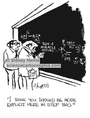
Many of you will be familiar with this cartoon, used in many texts on the use of Theories of Change
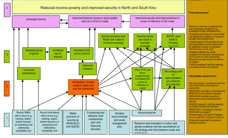
If you look at diagrammatic versions of Theories of Change you will see two type of graphic elements: nodes and links between the nodes. Nodes are always annotated, describing what is happening at this point in the process of change. But the links between nodes are typically not annotated with any explanatory text. Occasionally (10% of the time in the first 300 pages of Funnell and Rogers book on Purposeful Program Theory) the links might be of different types e.g. thick versus thin lines or dotted versus continuous lines. The links tell us there is a causal connection but rarely do they tell us what kind of causal connection is at work. In that respect the point of Sidney Harris's cartoon applies to a large majority of graphic representations of Theories of Change.

In fact there are two type of gaps that should be of concern. One is the nature of individual links between nodes. The other is how a given set of links converging on a node work as a group, or not, as it may be. Here is an example from the USAID Learning Lab web page. Look at the brown node in the centre, influenced by six other green events below it

 In this part of the diagram there are a number of possible ways of interpreting the causal relationships between the six green events underneath the brown event they all connect to:

The first set are binary possibilities, where the events are or are not important:

1. Some or all of these events are necessary for the brown event to occur.
2. Some of all of the events are sufficient for the brown event to occur
3. None of the events are necessary or sufficient but two or more of combinations of these are sufficient

The fourth is more continuous
4. The more of these events that are present (and the more of each of these) the more the brown event will be present
5. The relationship may not be linear, but exponential or s-shaped or more complex polynomial shapes (likely if there are feedback loops present)

These various possibilities have different implications for how this bit of the Theory of Change could be evaluated. Necessary or sufficient individual events will be relatively easy to test for. Finding combinations that are necessary or sufficient will be more challenging, because there potential many (2^5=32 in the above case). Likewise finding linear and other kinds of continuous relationships would require more sophisticated measurement. Michael Woolcock (2009) has written on the importance of thinking through what kinds of impact trajectories our various contextualised Theories of Change might suggest we will find in this area.

Of course the gaps I have pointed out are only one part of the larger graphic Theory of Change shown above. The brown event is itself only one of a number of inputs into other events shown further above, where the same question arises about how they variously combine.

So, it turns out that Sydney Harris's cartoon is really a gentle understatement of how much more we really need to specify before we can have an evaluable Theory of Change on our hands.