Friday, February 28, 2020

Temporal networks: Useful static representations of dynamic events

.
I have just found out about the existence of a field of study called "temporal networks"  Here are two papers I came across

Linhares, C. D. G., Ponciano, J. R., Paiva, J. G. S., Travençolo, B. A. N., & Rocha, L. E. C. (2019). Visualisation of Structure and Processes on Temporal Networks. In P. Holme & J. Saramäki (Eds.), Temporal Network Theory (pp. 83–105). Springer International Publishing. https://doi.org/10.1007/978-3-030-23495-9_5
Li, A., Cornelius, S. P., Liu, Y.-Y., Wang, L., & Barabási, A.-L. (2017). The fundamental advantages of temporal networks. Science, 358(6366), 1042–1046. https://doi.org/10.1126/science.aai7488

Here is an example of a temporal network:
Figure 1


The x-axis represents intervals of time The y-axis represents six different actors. The curved lines represent particular connections between particular actors at particular moments of time. For example, email messages or phone calls.

In Figure 2 below, we can see a more familiar type of network structure. This is the same network as that shown in Figure 1. The difference is that it is an aggregation of all the interactions over the 24 time periods shown in Figure 1. The numbers in red refer to the number of times that each communication link was active in this whole period.

This diagram has both some strengths and weaknesses. Unlike Figure 1 it shows us the overall structure of interactions. On the other hand, it is obscuring the possible significance of variations in the sequence within which these interactions take place over time. In a social setting involving people talking to each other, the sequencing of when different people talk to each other could make a big difference to the final state of the relationships between the people in the network.

Figure 2
How might the Figure 1 way of representing temporal networks be useful?

The first would be as a means of translating narrative accounts of events into network models of those events. Imagine that the 24 time periods are a duration of time covered by events described in a novel. And events in periods 1 to 5 are described in one particular chapter of the novel. In a chapter, the story is all about the interactions between actors 2, 3 and 4. In subsequent chapters, their interactions with other actors are described.
Figure 3
Now, instead of a novel, imagine a narrative describing the expected implementation and effects of a particular development programme. Different stakeholders will be involved at different stages. Their relationships could be "transcribed" into a temporal network, and also then into a static network diagram (as in Figure 2) which would describe the overall set of relationships for the whole programme period.

The second possible use would be to adapt the structure of a temporal network model to convert it into a temporal causal network model. Such as shown in Figure 4 below. The basic structure would remain the same, with actors list row by row and time listed column by column. The differences would be that:

  1. The nodes in the network could be heterogeneous, reflecting different kinds of activities or events, undertaken/involved in by each actor. Not homogenous as in Figure 1 example above.
  2. The connections between activities/events would be causal, in one direction or in both directions. The latter signifying a two-way exchange of some kind. In Figure 1 causality may be possible and even implied, but it can't simply be assumed.
  3. There could also be causal links between activities within the same row, meaning an actor's particular at T1 influenced another of their activities in T3, for example. This possibility is not available in Figure 1 type model
  4. Some spacer" rows and columns are useful to give the node descriptions more and to make the connections between them more visible

Figure 4 is a stylised example. By this I mean I have not detailed the specifics of each event or characterised the nature of the connections between them. In a real-life example this would be necessary. Space limitations on the chart would necessitate very brief titles + reference numbers or hypertext links.
Figure 4: Stylised example
While this temporal causal network looks something a Gantt chart it is different and better.

  1. Each row is an about a specific actor, whereas in a Gantt chart each row is about a specific activity 
  2. Links between activities signal a form of causal influence , whereas in a Gantt chart they signal precedence which may or may not have causal implications
  3. Time periods can be more flexibly and abstractly defined, so long as they follow a temporal sequence. Whereas in a Gannt chart these are more likely to be defined in specific units like days, weeks or months, or specific calendar dates


How does a temporal causal network compare to more conventional representations of Theories of Change? Results chains versions of a Theory of Change do make use of a y-axis to represent time but are often much less clear about the actors involved in the various events that happen over time. Too often these describe what might be called a sequence of disembodied events i.e. abstract descriptions of key events. On the other hand, more network like Theories of Change can be better at identifying the actors involved in the relationships between them. But it is very difficult to also capture the time dimension in a static network diagram. Associated with this problem is the difficulty of then constructing any form of text narrative about the events described in the network.

One possible problem is whether measurable indicators could be developed for each activity that is shown. Another is how longer-term outcomes, happening over a period of time, might be captured. Perhaps the activities associated with their measurement would be what would be shown in a Figure 4 type model.

Postscript: The temporal dimension of network structures is addressed in dynamic network models, such as those captured in Fuzzy Cognitive Networks. With each iteration of a dynamic network model, the states of the nodes/events/actors in the network are updated according to the nature of the links they have with others in the network. This can lead to quite complex patterns of change in the network over time. But one of the assumptions built into such models is that all relationships are re-enacted in each iteration. This is clearly not the case in our social life. Some relationships are updated daily, others much less frequently. The kind of structure shown in Figure 1 above seems more appropriate view. But can these be used for simulation purposes, where all nodes would have values that are influenced by their relationships with each other?


Tuesday, November 05, 2019

Combining the use of the Confusion Matrix as a visualisation tool with a Bayesian view of probability


Caveat: This blog posting is total re-write of an earlier version on the same subject. Hopefully, this one will be more coherent and more useful!


Quick Summary
In this revised blog I:
1. Explain what a Confusion Matrix is and what Bayes Theorem says
2. Explain three possible uses for Bayes Theorem when combined with a Confusion Matrix

What is a Confusion Matrix?


A Confusion Matrix is a tabular structure that displays four possible combinations of two types of events, each of which may have happened, or not happened. Wikipedia provides a good description.

Here is an example, with real data, taken from an EvalC3 analysis.


    TP = True Positive, FP = False Positive, FN = False Negative, TN = True Negative

In this example, the top row of the table tells us that when the attributes of a particular predictive model (as was identified by EvalC3) are present there are 8 cases where the expected outcome is also present (True Positives). But there are also 4 cases where the expected outcome is not also present (False Positives). In all the remaining cases (all in the bottom row), which do not have the attributes of the predictive model, there is one case where the outcome is nevertheless present (False Negative) and 13 cases where the outcome is not present (True Negative). As can be seen in the Wikipedia article, and also in EvalC3, there is a range of performance measures which can be used to tell is how well this particular predictive model is performing – and all of these measures are based on particular combinations of the types of values in this Confusion Matrix.

Bayes theorem


According to Wikipedia, 'Bayes' theorem (alternatively Bayes's theorem, Bayes's law or Bayes's rule) describes the probability of an event, based on prior knowledge of conditions that might be related to the event '

The Bayes formula reads as follows:

P(A|B) = The probability of A, given the presence of B
P(B|A) = The probability of B, given the presence of A
P(A) = The probability of A
P(B) = The probability of B

This formula can be calculated using data represented within a Confusion Matrix. Using the example above, the outcome being present = A in the formula, and the model attributes being present = B in the formula.  So this formula could tell us the probability of finding True Positives i.e when these are both present. Here is how the various parts of the formula are calculated, along with some alternate names for their parts:


So far, in this blog posting, the Bayes formula simply provides one additional means of evaluating the usefulness of prediction models found through the use of machine learning algorithms, using EvalC3 or other means.

Process Tracing application


But I'm more interested here in the use of the Bayes formula for process tracing purposes, something that Barbara Befani has written about. Process tracing is all about articulating and evaluating conjectured causal processes in detail. A process tracing analysis is usually focused on one case or instance, not multiple cases. It is a within-case rather than cross-case method of analysis. 

In this context, the rows and columns of the Confusion Matrix have slightly different names. The columns described whether a theory is true or not, and the rows described whether evidence of a particular kind is present or not. More importantly, the values in the cells are not numbers of actual observed cases.  Rather, they are the analyst's interpretation of what is described as the "conditional probabilities" of what is happening in one case or instance.  In the two cells in the first column, the analyst puts their own probability estimates, between zero and one, reflecting the likelihood: (a) that if the evidence is present in the theory is true, that a man was the murderer, and (B) that if the evidence is absent the theory is true. In the two cells in the second column, the analyst puts their own probability estimates, between one and two, reflecting the likelihood: (a) that if the evidence is theory is not true, that a man was not the murderer, and (B) that if the evidence is absent the theory is not true. 

Here is a notional example. The theory is that a man was the murderer. The available evidence suggests that the murderer would have needed exceptional strength.
The analyst also needs to enter their "priors". That is, their belief about the overall prevalence of the theory being true i.e. men are most often the murderers. Wikipedia suggests that 80% of murders are committed by men.These prior probabilities are entered in the third row of the Confusion Matrix, as shown below. The main cell values are then updated in the light of those new value, as also shown below

Using the Bayes formula provided above, we can now calculate P(A|B),i.e. man being the murderer if the evidence x was found..  P(A|B) = TP/(TP+FP) = 0.97

"Naive Bayes" 


This is another useful application, based on an algorithm of this name, described here. 
On that web page, an example is given of a data set where each row describes three attributes of a car (color, type and origin) and whether the car was stolen or not. Predictive models (Bayesian or otherwise)  could be developed to identify how well each of these attributes predicts whether a car is stolen or not. In addition, we may want to know how good a predictor the combination of all these three individual predictors is. But the dataset does not include any examples of these types of cases.

The article then explains how the probability of a combination of all three of these attributes can be used to predict whether a car is stolen or not.

1. Calculate (TP/(TP+FP)) for color * (TP/(TP+FP)) for type * (TP/(TP+FP)) for origin 
2. Calculate (FP/(TP+FP)) for color * (FP/(TP+FP)) for type * (FP/(TP+FP)) for origin
3. Compare the two calculated values. If the first is higher classify a car as most likely stolen. If it is lower, classify a car as most likely not stolen.

A caution: Naive Bayes calculations assume (as its name suggests) that each of the attributes of the predictive model is causally independent. This may not always be the case.

In summary


Bayes formula seems to have three uses:

1. As an additional performance measure when evaluating predictive models generated by any algorithm, or other means. Here the cell values do represent numbers of individual cases.

2.  As a way of measuring the probability of a particular causal mechanism working as proposed, within the context of a process-tracing exercise. Here the cell values are conjectures about relative probabilities relating to a specific case, not numbers of individual cases.

3.  As a way of measuring the probability of a combination of predictive models being a good predictor of an outcome of concern. Here the cell values could represent either multiple real cases or conjectured probabilities (part of a Bayesian analysis of a causal mechanism) regarding events within one case only.


Saturday, October 19, 2019

On finding the weakest link...


Last week I read and responded to a flurry of email exchanges that were prompted by Jonathan Morell circulating a think piece titled 'Can Knowledge of Evolutionary Biology and Ecology Inform Evaluation?". Putting aside the details of the subsequent discussions, many of the participants were in agreement with the idea that evaluation theory and practice could definitely benefit by more actively seeking out relevant ideas from other disciplines.

So when I was reading Tim Harford's column in this weekend's Financial Times, titled 'The weakest link in the strong Nobel winner 'I was very interested in this section:
Then there’s Prof Kremer’s O-ring Theory of Development, which demonstrates just how far one can see from that comfortable armchair. The failure of vulnerable rubber “O-rings” destroyed the Challenger space shuttle in 1986; Kremer borrowed that image for his theory, which — simply summarised — is that for many production processes, the weakest link matters.
Consider a meal at a fancy restaurant. If the ingredients are stale, or the sous-chef has the norovirus, or the chef is drunk and burns the food, or the waiter drops the meal in the diner’s lap, or the lavatories are backing up and the entire restaurant smells of sewage, it doesn’t matter what else goes right. The meal is only satisfactory if none of these things go wrong.
As you will find when you do a Google search to find out more information about the O-ring Theory of Development, you will find there is a lot more to the theory than this, much of it very relevant to evaluators.  Prof Kremer is an economist, by the way.

This quote was of interest to me because in the last week I have been having discussions with a big agency in London about how to go ahead with an evaluation of one of their complex programs. By complex, in this instance, I mean a program that is not easily decomposable into multiple parts – where it might otherwise be possible to do some form of cross-case analysis, using either observational data or experimental data. We have been talking about strategies for identifying multiple alternative causal pathways that might be at work, connecting the program's interventions with the outcomes it is interested in. I'll be reporting more on this in the near future, I hope.

But let's go right now to a position a bit further along, where an evaluation team has identified which causal pathway (s) are most valuable/plausible/relevant. In those circumstances, particularly in a large complex program, the causal pathway itself could be quite long, with many elements or segments. This in itself is not a bad thing, because the more segments there are in a causal pathway that can be examined then the more vulnerable to disproof the theory about that causal pathway is – which in principle is a good thing – especially if the theory is not disproved – it means it's a pretty good theory. But on the other hand, a causal pathway with many segments or steps pose a problem for an evaluation team, in terms of where they are going to allocate their resource-limited attention.

What I like about the paragraph from Tim Harford's column is the sensible advice that it provides to an evaluation team in this type of context. That is, look first for the weakest link in the causal pathway. Of course, that does raise a question of what we mean by the weakest link. A link may be weak in terms of its verifiability or its plausibility, or in other ways. My inclination at this point would be to focus on the weakest link in terms of plausibility. Your thoughts on this would be appreciated. How one would go about identifying such weak links would also need attention. Two obvious choices would be either to use expert judgement or different stakeholders perspectives on the question. Or probably better, a combination of both.

Postscript: I subsequently discovered some other related musings:


.

Wednesday, October 02, 2019

Participatory design of network models: Some implications for analysis


I recently had the opportunity to view a presentation by Luke Craven. You can see it here on YouTube:https://www.youtube.com/watch?v=TxmYWwGKvro

Luke has developed an impressive software application as a means of doing what he calls a 'Systems Affects 'analysis. I would describe it as a particular form of participatory network modelling. The video is well worth watching. There is some nice technology at work within this tool. For example,see how a text search algorithms can facilitate the process of coding a diversity of responses by participants into a smaller subset of usable categories. In this case, descriptions of different types of causes and effects at work.

In this blog, I want to draw your attention to one part of the presentation, which is in matrix form which I have copied below. (Sorry for the poor quality, it's a copy of a YouTube screen)


In social network analysis jargon this is called an "adjacency matrix". Down the left-hand side is a list of different causal factors identified by survey respondents. This list is duplicated across the top row. The cell values refer to the number of times respondents have mentioned the row factor being a cause of the column factor.

This kind of data can easily be imported into one of many different social network analysis visualisation software packages, as is pointed out by Luke in his video (I use Ucinet/NetDraw). When this is done it is possible to identify important structural features. Such as some causal factors having much higher 'betweenness centrality'. Such factors will be at the intersection of multiple causal paths. So, in an evaluation context, they are likely to be well worth investigating. Luke explores the significance of some of these structural features in his video.

In this blog, I want to look at the significance of the values in the cells of this matrix, and how they might be interpreted. At first glance, one could see them as measures of the strength of a causal connection between 2 factors mentioned by a respondent. But there are no grounds for making that interpretation. It is much better to interpret those values as a description of the prevalence of that causal connection. A particular cause might be found in many locations/in the lives of many respondents, but in each setting, it might still only be a relatively minor influence compared to others that are also present there.

Nevertheless, I think a lot can still be Done with this prevalence information. As I explained in a recent blog about the analysis of QuIP data we can add additional data to the adjacency matrix in a way that will make it much more useful. This involves 2 steps. Firstly, we can generate column and row summary figures, so that we can identify: (a) the total number of times a column factor has been mentioned, (b) the total number of times a row factor has been mentioned.  Secondly, we can use those new values to identify how often a row cause factor has been present but a column effect factor has not been and vice versa.  I will explain this in detail with the help of this imaginary example of the use of a type of table known as a confusion matrix. (For more information about the Confusion Matrix see this Wikipedia entry).
In this example 'increased price of livestock 'is one of the causal factors listed amongst others on the left side of an adjacency matrix of the kind shown above. And 'increased income 'is one of the effect factors of the kind listed amongst others across the top row in the kind of matrix shown above. In the green cell the 11 refers to a number of causal connections respondents have identified between the two factors. This number would be found in in a cell of an adjacency matrix, which links the row factor with a column factor.

The values in the blue cells of the confusion matrix are the respective road total and column total. Knowing the green and blue values we can then calculate the yellow values.  The number 62 refers to the incidence of all the other possible causal factors listed down the left side of a matrix. And a number 2 refers the incidence of all the other possible effects listed across the top of the matrix.
PS: In Confusion Matrix jargon the green cell is referred to as a True Positive, the yellow cell with the 2 as a False Positive, and yellow cell with a 62 as a False Negative. The blank cell is known as a True Negative.

Once we have this more complete information we can then do simple analyses that can tell us just how important, or not so important, the 11 mentions of the relationship between this cause and effect are. ( I will duplicate some of what I've said in the previous post here) For example, if the value of 2 was in fact a value of 0 this would be telling us that the presence of an increased price of livestock was sufficient for the outcome of increased income to be present. However, the value of 62, would be telling us that while the increased price of livestock is sufficient it is not necessary for increased income. In fact, most of the cases have increased income arises from other causal factors.

Alternatively, we can imagine the value of 62 is now zero while the value of 2 is still present. In this situation, this would be telling us that an increased price of livestock is necessary for increased income. There are no cases where income increased income has arisen in the absence of increased price of livestock. But it may not always be sufficient. If the value 2 is still there it is telling us that in some cases although the increased price of livestock is necessary it is not sufficient. Some other factor is missing or obstructing things and causing the outcome of increased income not to occur.

Alternatively, we can imagine that the value 2 is now much higher, say 30. In this context, the increased price of livestock is neither necessary or sufficient for the outcome. And in fact, more often than not it is an incorrect predictor, and is only present in a small proportion of all the cases where there is increased income. The point being made here is that the value in the TruePositive cell (11) has no significance unless it is seen in the context of the other values in the Confusion Matrix. Looking back at the big matrix at the top of this blog we can't interpret the significance of the cell values on their own.

So far this discussion has not taken us much further than discussion in the previous blog. In that blog, I ended with the concern that while we could identify the relative importance of individual causal factors in this sort of one-to-one analysis we couldn't do the more interesting type of configurational analyses, where we might identify the relative importance of different combinations of causal factors.

I now think it may be a possibility. If we look back at the matrix at the top of this blog we can imagine that there is in fact a stack such matrices one sitting above the other. And each of those matrices represents one respondent's responses. And the matrix at the bottom is a kind of summary matrix, where the individual cells are totals of the values of all the cells sitting immediately above them in the other matrices.

From each individual's matrix we could extract a string of data telling us which of each of the causal factors have been reported as present (1) or absent (0) and whether particular outcome/effect of interest was reported as present (1) or absent (0). Each of those strings can be listed as a 'case ' in the kind of data set used in predictive modelling. In those datasets, each row represents a case, and each column represents an attribute of those cases, plus the outcome of interest.

Using EvalC3, an Excel predictive modelling app, it would then be possible to identify one or more configurations i.e. combinations of reported attribute/causes which are good predictors of the reported effect/outcome.

Caveat: There are in fact 2 options in the kinds of strings of data that could be extracted from the individuals' matrices. One would list whether the 'cause' attributes were mentioned as present, or not, at all. The other would only list the cause attribute is present or not, specifically in relation with the effect/outcome of interest.

Sunday, June 09, 2019

Extracting additional value from the analysis of QuIP data


James Copestake, Marlies Morsink and Fiona Remnant are the authors of "Attributing Development Impact: The Qualitative Impact Protocol Casebook" published this year by Practical Action
As the title suggests, the book is all about how to attribute development impact, using qualitative data - an important topic that will be of interest to many. The book contents include:
  • Two introductory chapters  
    • 1. Introducing the causal attribution challenge and the QuIP | 
    • 2. Comparing the QuIP with other approaches to development impact evaluation 
  • Seven chapters describing case studies of its use in Ethiopia, Mexico, India, Uganda, Tanzania, Eastern Africa, and England
  • A final chapter synthesising issues arising in these case studies
  • An appendix detailing guidelines for QuIP use

QuIP is innovative in many respects. Perhaps most notably, at first introduction, in the way data is gathered and coded. Neither the field researchers or the communities of interest are told which organisation's interventions are of interest, an approach known as "double blindfolding".  The aim here is to mitigate the risk of "confirmation bias", as much as is practical in a given context.

The process of coding the qualitative data that is collected is also interesting. The focus is on identifying causal pathways in the qualitative descriptions of change obtained through one to one interviews and focus group discussions. In Chapter One the authors explain how the QuIP process uses a triple coding approach, which divides each reported causal pathway into  three elements:

  • Drivers of change (causes). What led to change, positive or negative?
  • Outcomes (effects) What change/s occurred, positive or negative?
  • Attribution: What is the strength of association between the causal claim and the activity or project being evaluated
"Once all change data is coded then it is possible to use frequency counts to tabulate and visualise the data in many ways, as the chapters that follow illustrate". An important point to note here is that although text is being converted to numbers, because of the software which has been developed, it is always possible to identify the source text for any count that is used. And numbers are not the only basis which conclusions are reached about what has happened, the text of respondents' narratives are also very important sources.

That said, what interests me most at present are the emerging options for the analysis of the coded data. Data collation and analysis was initially based on a custom-designed Excel file, used because 99% of evaluators and program managers are already familiar with the use of Excel. However, more recently, investment has been made in the development of a customised version of MicroStrategy, a free desktop data analysis and visualization dashboard. This enables field researchers and evaluation clients to "slice and dice" the collated data in many different ways, without risk of damaging the underlying data, and its use involves a minimal learning curve. One of the options within MicroStrategy is to visualise the relationships between all the identified drivers and outcomes, as a network structure. This is of particular interest to me, and is something that I have been exploring with the QuIP team and with Steve Powell, who has been working with them

The network structure of driver and outcome relationships 


One way QuIP coded data has been tabulated is in the form of a matrix, where rows = drivers and columns = outcomes and cell values = incidence of reports of the connection between a given row and a given column (See tables on pages 67 and 131). In these matrices, we can see that some drivers affect multiple outcomes and some outcomes are affected by multiple drivers. By themselves, the contents of these matrices are not easy to interpret, especially as they get bigger. One matrix provided to me had 95 drivers, 80 outcomes and 254 linkages between these. Some form of network visualisation is an absolute necessity.

Figure 1 is a network visualisation of the 254 connections between drivers and outcomes. The red nodes are reported drivers and the blue nodes are the outcomes that they have reportedly led to. Green nodes are outcomes that in turn have been drivers for other outcomes (I have deliberately left off the node labels in this example). While this was generated using Ucinet/Netdraw, I noticed that the same structure can also be generated by the MicroStrategy.


Figure 1

It is clear from a quick glance that there is still more complexity here than can be easily made sense of. Most notably in the "hairball" on the right.

One way of partitioning this complexity is to focus in on a specific "ego network" of interest. An ego network is a combination of (a) an outcome plus (b) all the other drivers and outcomes it is immediately linked to,  plus (c) the links between those. MicroStartegy already provides (a) and (b) but probably could be tweaked to also provide (c). In Ucinet/Netdraw it is also possible to define the width of the ego network, i.e. how many links out from ego to collect connections to and between  "alters". Here in Figure 2 is one ego network that can be seen in the dense cluster in Figure 1

Figure 2


Within this selective view, we can see more clearly the different causal pathways to an outcome. There are also a number of feedback loops here, between pairs (3) and larger groups of outcomes (2).

PS: Ego networks can be defined in relation to a node which represents a driver or an outcome. If one selected a driver as the ego in the ego network then the resulting network view would provide an "effects of a cause" perspective. Whereas if one selected an outcome as the ego, then the resulting network view would provide a "causes of an outcome" perspective.

Understanding specific connections


Each of the links in the above diagrams, and in the source matrices, have a specific "strength" based on a choice of how that relationship was coded. In the above example, these values were "citation counts,  meaning one count per domain per respondent. Associated with each of these counts are the text sources, which can shed more light on what those connections meant.

What is missing from the above diagrams is numerical information about the nodes, i.e. the frequency of mentions of drivers and outcomes. The same is the case for the tabulated data examples in the book (pages 67, 131). But that data is within reach.

Here in Figure 7 and 8 is a simplified matrix. and associated network diagram, taken from this publication: QuIP and the Yin/Yang of Quant and Qual: How to navigate QuIP visualisations"

In Figure 7 I  have added row and column summary values in red, and copied these in white on to the respective nodes in Figure 8. These provide values for the nodes, as distinct from the connections between them.


Why bother? Link strength by itself is not all that meaningful. Link strengths need to be seen in context, specifically: (a) how often the associated driver was reported at all, and (b) how often the associated outcome was reported at all.  These are the numbers in white that I have added to the nodes in the network diagram above.

Once this extra information is provided we can insert it into a Confusion Matrix and use it to generate two items of missing information: (a) the number of False Positives, in the top right cell, and (b) the number of False Negatives (in the bottom left cell). In Figure 3, I have used Confusion Matrices to describe two of the links in the Figure 8 diagram.


Figure 3
It now becomes clear that there is an argument for saying that  the link with a value of 5, between "Alternative Income" and "Increased income" is more important than the link with the value of 14 between "Rain/recovering from drought" and "Healthier livestock"

The reason? Despite the first link looking stronger (14 versus 5) there is more chance that the expected outcome will occur when the second driver is present. With the first driver the expected outcome only happens 14 of 33 times. But with the second driver the expected outcome happens 5 of the 7 times.

When this analysis is repeated for all the links where there is data (6 in Figure 8 above), it turns out that only two links are of this kind, where the outcome is more likely to be present when the driver is present. The second one is the link between Increased price of livestock and
Increased income, as shown in the Confusion Matrix in Figure 4 below

Figure 4
There are some other aspects of this kind of analysis worth noting.  When "Increased price of livestock" is compared to the one above (Alternative income...),  it accounts for a bigger proportion of cases where the outcome is reported i.e. 11/73 versus 5/73.

One can also imagine situations where the top right cell (False Positive)  is zero. In this case, the driver appears to be sufficient for the outcome i.e. where it is present the outcome is present. And one can imagine situations where the bottom left cell (False Negative) is zero. In this case, the driver appears to be necessary for the outcome i.e. where it is not present the outcome is also not present.


Filtered visualisations using Confusion Matrix data


When data from a Confusion Matrix is available, this provides analysts with additional options for generating filtered views of the network of reported causes. These are:

  1. Show only those connected drivers which seem to account for most instances of a reported outcome. I.e. the number of True Positives (in the top left cell) exceeds the number of False negatives (in the bottom left cell)
  2. Show only those connected drivers which are more often associated with instances of a reported outcome (the True Positive in the top left cell), than its absence (the false Positive, in the top right cell). 

Drivers accounting for the majority of instances of the reported outcome


Figure 5 is a filtered version of the blue, green and red network diagram shown in Figure 1 above. A filter has retained links where the True Positive value in the top left cell of the Confusion Matrix (i.e. the link value) is greater than the associated False Negative value in the bottom left cell. This presents a very different picture to the one in Figure 1.

Figure 5


Key: Red nodes = drivers, Blue nodes = outcomes, Green nodes = outcomes that were also in the role of drivers.

Drivers more often associated with the presence of a reported outcome than its absence


A filter has retained links where the True Positive value in the top left cell of the Confusion Matrix (i.e. the link value) is greater than the associated False Positive value in the top right cell. 

Figure 6

Other possibilities


While there are a lot of interesting possibilities as to how to analyse QuIP data , one option does not yet seem available. That is the possibility of identifying instances of "configurational causality" By this, I mean packages of causes that must be jointly present for an outcome to occur. When we look at the rows in Figure 7 it seems we have lists of single causes, each of which can account for some of the instances of the outcome of interest. And when we look at Figures 2 and 8 we can see that there is more than one way of achieving an outcome. But we can't easily identify any "causal packages" that might be at work.

I am wondering to what extent this might be a limitation built into the coding process. Or, if better use of existing coded information might work. Perhaps the way the row and column summary values are generated in Figure 7 needs rethinking.

Looking at the existing network diagrams these provide no information about which connections were reported by whom. In Figure 2, take the links into "Increased income" from "Part of organisation x project" and "Social Cash Transfer (Gov)"  Each of these links could have been reported by a different set of people, or they could have been reported by the same set of people. If the latter, then this could be an instance of "configurational causality" . To be more confident we would need to establish that people who reported only one of the two drivers did not also report the outcome.

Because all QuIP coded values can be linked back to specific sources and their texts, it seems that this sort of analysis should be possible. But it will take some programming work to make this kind of analysis quick and easy.

PS 1: Actually maybe not so difficult. All we need is a matrix where:

  • Rows = respondents
  • Columns = drivers & outcomes mentioned by respondents
  • Cell values =  1/0 mean that row respondent did or did not mention that column driver or outcome
Then use QCA, or EvalC3, or other machine learning software, to find predictable associations between one or more drivers and any outcome of interest. Then check these associations against text details of each mention to see if a causal role is referred to and plausible.

That said, the text evidence would not necessarily provide the last word (pun unintended). It is possible that a respondent may mention various driver-outcome relationships e.g. A>B, C>D, and A>E but not C>E. Yet, when analysing data from multiple respondents we might find a consistent co-presence of references to C and E (though no report of actual causal relations between them). The explanation may simply be that in the confines of a specific interview there was not time or inclination to mention this additional specific relationship.

In response...

James Copestake has elaborated on this final section as follows "We have discussed this a lot, and I agree it is an area in need of further research. You suggest that there may be causal configurations in the source text which our coding system is not yet geared up to tease out. That may be true and is something we are working on. But there are two other possibilities. First, that interviewers and interviewing guidelines are not primed as much as they could be to identify these. Second, respondents narrative habits (linked to how they think and the language at their disposal) may constrain people from telling configurational stories. This means the research agenda for exploring this issue goes beyond looking at coding"

PS: Also of interest: Attributing development impact: lessons from road testing the QuIP. James Copestake, January 2019

Saturday, May 18, 2019

Evaluating innovation...


Earlier this week I sat in on a very interesting UKES 2019 Evaluation Conference presentation "Evaluating grand challenges and innovation" by Clarissa Poulson and Katherine May (of IPE Tripleline).

The difficulty of measuring and evaluating innovation reminded me of similar issues I struggled with many decades ago when doing the Honours year of my Psychology degree, at ANU. I had a substantial essay to write on the measurement of creativity! My faint memory of this paper is that I did not make much progress on the topic.

After the conference, I did a quick search to find how innovation is defined and measured. One distinction that is often made is between invention and innovation. It seems that innovation = invention + use.  The measurement of the use of an invention seems relatively unproblematic. But if the essence of the invention aspect of innovation is newness or difference, then how do you measure that?

While listening to the conference presentation I thought there were some ideas that could be usefully borrowed from work I am currently doing on the evaluation and analysis of scenario planning exercises. I made a presentation on that work in this year's UKES conference (PowerPoint here).

In that presentation, I explained how participants' text contributions to developing scenarios (developed in the form of branching storylines) could be analyzed in terms of their diversity. More specifically, three dimensions of diversity, as conceptualised by Stirling (1998):
  • Variety: Numbers of types of things 
  • Balance: Numbers of cases of each type 
  • Disparity: Degree of difference between each type 
Disparity seemed to be the hardest to measure, but there are measures used within the field of Social Network Analysis (SNA) that can help. In SNA distance between actors or other kinds of nodes in a network, is measured in terms of "geodesic", i.e. the number of links between any two nodes of interest. There are various forms of distance measure but one simple one is "Closeness", which is the sum of geodesic distances from a node in a network and all other nodes in that network (Borgatti et al, 2018). This suggested to me one possible way forward in the measurement of the newness aspect of an innovation.

Perhaps counter-intuitively, one would ask the inventor/owner of an innovation to identify what other product, in a particular population of products, that their product was most similar to. All other unnamed products would be, by definition, more different. Repeating this question for all owners of the products in the population would generate what SNA people call an  "adjacency matrix", where a cell value (1 or 0) tells us whether or not a specific row item is seen as most similar to a specific column item. Such a matrix can then be visualised as a network structure, and closeness values can be calculated for all nodes in that network using SNA software (I use UCINET/Netdraw) . Some nodes will be less close to other nodes, than others. That measure is a measure of their difference or "disparity"

Here is a simulated example, generated using UCINET. The blue nodes are the products. Larger blue nodes are more distant i.e. more different, from all the other nodes. Node 7 has the largest Closeness measure (28) i.e. is the most different, whereas node 6 has the smallest Closeness measure (18) i.e. is the least different.

There are two other advantages to this kind of network perspective. The first is that it is possible to identify the level of diversity in the population as a whole.  SNA software can calculate the average closeness of all nodes in a network, to all others.  Here is an example, of a network where nodes are much more distant from each other than the example above


The second advantage is that a network visualisation, like the first one above, makes it possible to identify any clusters of products. i.e. products that are each most similar to each other. No example is shown here, but you can imagine one!.

So, three advantages of this measurement approach:
1. Identification of how relatively different a given product or process is
2. Identification of diversity in a whole population of products
3. Identification of types of differences (clusters of self-similar products) within that population.

Having identified a means of measuring degrees of newness or difference (and perhaps categorising types of these), the correlation between these and different forms of product usage could then be explored.

PS: I will add a few related papers of interest here:

Measuring multidimensional novelty


Sometimes the new entity may be novel in multiple respects but in each respect only when compared to a different entity. For example, I have recently reviewed how my participatory scenario planning app ParEvo is innovative, in respect to (a) its background theory, (b) how it is implemented, (c) how the results are represented. In each area, there was a different "most similar" comparator practice.

The same network visualisation approach can be taken as above. The difference is the new entity will have links to multiple existing entities, not one, and the link to each entity will have varying "weight", reflecting the number of shared attributes it has with that entity. The aggregate value of the link weights for novel new entities will be less than those of other existing entities.  

Information on the nature of the shared attributes can be identified in at least two ways:
(a) content analysis of the entities, if they are bodies of text (as in my own recent examples)
(b) card/pile sorting of the entities by multiple respondents

In both cases, this will generate a matrix of data, known as a two-mode network. Rows will represent entities and columns will represent their attributes (as via content analysis) or pile membership.

Novelty and Most Significant Change

The Most Significant Change (MSC) technique is a participatory approach to impact monitoring and evaluation, described in detail in the 2005 MSC Guide. The core of the approach is a question that asks "In your opinion, what was the most significant change that took place in ...[location]...over the last ...[time period]?" This is then followed up by questions seeking both descriptive details and an explanation of why the respondent thinks the change is most significant to them.

A common (but not essential) part of MSC use is a subsequent content analysis of the collected MSC stories of change. This involves the identification of different themes running through the stories of change, then the coding of the presence of these themes in each MSC story. One of the outputs will be a matrix, where rows = MSC stories and columns = different themes and cell values = the presence or absence of a particular column theme in a particular row story.

Such matrices can be easily imported into network analysis and visualisation software (e.g. Ucinet&Netdraw) and displayed as a network structure. Here the individual nodes represent individual MSC stories and individual themes. Links show which story has which theme present (= a two-mode matrix). The matrix can also be converted into two different types of one-mode matrix, where (a) stories are connected to stories by N number of common themes, and (b) themes are connected to themes by N number of common stories.

Returning to the focus on novelty, with each of the one-mode networks, our attention should be on (a) story nodes on the periphery of the network, and (b) on story nodes with a low total number of shared themes with other nodes (found by adding their link values). Network software usually enables filtering by multiple means, including link values, so this will help focus on nodes that have both characteristics.

I think this kind of analysis could add a lot of value to the use of MSC as a means of searching for significant forms of change, in addition to the participatory analytic process already built into the MSC process.


Thursday, March 28, 2019

Where there is no (decent / usable) Theory of Change...


I have been reviewing a draft evaluation report in which two key points are made about the relevant Theory of Change:

  • A comprehensive assessment of the extent to which expected outcomes were achieved (effectiveness) was not carried out, as the xxx TOC defines these only in broad terms.
  •  ...this assessment was also hindered by the lack of a consistent outcome monitoring system.
I am sure this situation is not unique to this program. 

Later on the same report, I read about the evaluation's sampling strategy. As with many other evaluations I have seen, the aim was to sample a diverse range of locations in such a way that was maximally representative of the diversity of how and where the program was working. This is quite a common approach and a reasonable one at that.

But it did strike me later on that this intentionally diverse sample was an underexploited resource. If 15 different locations were chosen, one could imagine a 15 x 15 matrix. Each of the cells in the matrix could be used to describe how a row location compared to a column location. In practice, only half the matrix would be needed, because each relationship would be mentioned twice e.g. Row location A and its relation to Column location J would also be covered by Row location J and its relation to Column location A.

What sort of information would go in such cells? Obviously, there could be a lot to choose from. But one option would be to ask key stakeholders, especially those funding and/or managing any two compared locations. I would suggest they be asked something like this:
  • "What do you think is the most significant difference between these two locations/projects, in the ways they are working?"
And then ask a follow-up question...
  • "What difference do you think this difference will make?"
The answers are potential (if...then...) hypotheses, worth testing by an evaluation team. In a matrix generated by a sample of 15 locations, this exercise could generate ((15*15)-15))/2 = 105 potentially useful hypotheses, which could then be subject to a prioritisation / filtering exercise, which should include considerations of their evaluability (Davies, 2013). More specifically, how they relate to any Theory of Change, whether there is relevant data available, and whether any stakeholders are interested in the answers.

Doing so might also help address a more general problem, which I have noted elsewhere (Davies, 2018). And which was also a characteristic of the evaluation mentioned above. That is the prevalence in evaluation ToRs of open-ended evaluation questions, rather than hypothesis testing questions: 
" While they may refer to the occurrence of specific outcomes or interventions, their phrasings do not include expectations about the particular causal pathways that are involved. In effect these open-ended questions imply either that those posting the questions either know nothing, or they are not willing to put what they think they know on the table as testable propositions. Either way this is bad news, especially if the stakeholders have any form of programme funding or programme management responsibilities. While programme managers are typically accountable for programme implementation it seems they and their donors are not being held accountable for accumulating testable knowledge about how these programmes actually work. Given the decades-old arguments for more adaptive programme management, it’s about time this changed (Rondinelli, 1993; DFID, 2018).  (Davies, 2018)


Saturday, March 09, 2019

On using clustering algorithms to help with sampling decisions


I have spent the last two days in a training workshop run by BigML, a company that provides very impressive, coding-free, online machine learning services. One of the sessions was on the use of clustering algorithms, an area I have some interest in, but have not done much with, over the last year or so. The whole two days were very much centered around data and the kinds of analyses that could be done using different algorithms, and with more aggregated workflow processes.

Independently, over the previous two weeks, I have had meetings with the staff of two agencies in two different countries, both at different stages of carrying out an evaluation of a large set of their funded projects. By large, I mean 1000+ projects. One is at the early planning stage, the other is now in the inception stage. In both evaluations, the question of what sort of sampling strategy to use was a real concern.

My most immediate inclination was to think of using a stratified sampling process, where the first unit of analysis would be the country, then the projects within each country. In one of the two agencies, the projects were all governance related, so an initial country level sampling process seemed to make a lot of sense. Otherwise, the governance projects would risk being decontextualized. There were already some clear distinctions between countries in terms of how these projects were being put to work, within the agency's country strategy. These differences could have consequences. The articulation of any expected consequences could provide some evaluable hypotheses, giving the evaluation a useful focus, beyond the usual endless list of open-ended questions typical of so many evaluation Terms of Reference.

This led me to speculate on other ways of generating such hypotheses. Such as getting key staff managing these projects to do pile/card sorting exercises to sort countries, then projects, into pairs of groups, separated by a difference that might make a difference. These distinctions could reflect ideas embedded in an overarching theory of change, or more tacit and informal theories in the heads of such staff, which may nevertheless still be influential because they were operating (but perhaps untested) assumptions. They would provide other sources of what could be evaluable hypotheses.

However, regardless of whether it was a result of a systematic project document review or pile sorting exercises, you could easily end up with many different attributes that could be used to describe projects and then use as the basis of a stratified sampling process. One evaluation team seemed to be facing this challenge right now, of struggling to decide what attributes to choose. (PS: this problem can arise either from having too many theories or no theory at all)

This is where clustering algorithms, like K-means clustering, could come in handy. On the BigML website you can upload a data set (e.g. projects with their attributes) then do a one-click cluster analysis. This will find clusters of projects that have a number of interesting features: (a) Similarity within clusters is maximised, (b) Dissimilarity between clusters is maximised and visualised, (c) It is possible to identify what are called "centroids" i.e. the specific attributes which are most central to the identity of a cluster.

These features are relevant to sampling decisions. A sample from within a cluster will have a high level of generalisability within that cluster because all cases within that cluster are maximally similar. Secondly, other clusters can be found which range in their degree of difference from that cluster. This is useful if you want to find two contrasting clusters that might capture a difference that makes a difference.

I can imagine two types of analysis that might be interesting here:
1. Find a maximally different cluster (A and B) and see if a set of attributes found to be associated with an outcome of interest in A is also present in B. This might be indicative of how robust that association is
2, Find a maximally similar set of clusters (A and C) and see if incremental alterations to a set of attributes associated with an outcome in A means the outcome is not found associated in C. This might be indicative of how significant each attribute is.

These two strategies could be read as (1) Vary the context, (2) Vary the intervention

For more information, check out this BigML video tutorial on cluster analysis. I found it very useful

PS: I have also been exploring BigMLs Association Rule facility. This could be very helpful as another means of analysing the contents of a given cluster of cases. This analysis will generate a list of attribute associations, ranked by different measures of their significance. Examining such a list could help evaluators widen their view of the possible causal configurations that are present.


Saturday, July 14, 2018

Two versions of the Design Triangle - for choosing evaluation methods


Here is one version, based on Stern et al (2012) BROADENING THE RANGE
OF DESIGNS AND METHODS FOR IMPACT EVALUATIONS


A year later, in a review of the literature on the use of evaluability assessments, I proposed a similar but different version:


In this diagram "Evaluation Questions" are subsumed within the wider category of "Stakeholder demands". "Programme Attributes" have been disaggregated into "Project Design" (especially Theory of Change) and "Data Availability". "Available Designs" in effect disappears into the background, and if there was a 3D version, behind Evaluation Design.

Wednesday, July 19, 2017

Transparent Analysis Plans


Over the past years, I have read quite a few guidance documents on how to do M&E. Looking back at this literature, one thing that strikes me is how little attention is given to data analysis, relative to data collection. There are gaps, both in (a) guidance on "how to do it"  and (b) how to be transparent and accountable for what you planned to do and then actually did. In this blog, I want to provide some suggestions that might help fill that gap.

But first a story, to provide some background. In 2015 I did some data analysis for a UK consultancy firm. They had been managing a "Challenge Fund" a grant making facility funded by DFID, for the previous five years, and in the process had accumulated lots of data. When I looked at the data I found sapproximately170 fields. There were many different analyses that could be made from this data, even bearing mind one approach we had discussed and agreed on - the development of some predictive models, concerning the outcomes of the funded projects.

I resolved this by developing a "data analysis matrix", seen below. The categories on the left column and top row referred to different sub-groups of fields in the data set. The cells referred to the possibility of analyzing the relationship between the row sub-group of data and the column sub-group of data. The colored cells are those data relationships the stakeholders decided would be analyzed, and the initials in the cells referred to the stakeholder wanting that analysis. Equally importantly, the blank cells indicate what will not be analyzed.

We added a summary row at the bottom and a summary column to the right. The cells in the summary row signal the relative importance given to the events in each column. The cells in the summary column signal the relative confidence in the quality of data available in the row sub-groups. Other forms of meta-data could also have been provided in such summary rows and columns, which could help inform stakeholders choice of what relationships between the data should be analyzed.


A more general version of the same kind of matrix can be used to show the different kinds of analysis that can be carried out with any set of data. In the matrices below, the row and column letters refer to different variables / attributes / fields in a data set. There are three main types of analysis illustrated in these matrices, and three sub-types:
  • Univariate - looking at one measure only
  • Bivariate - looking at the relationships between two measures
  • Multivariate - looking at the relationship between multiple measures
But within the multivariate option there three alternatives, to look at:
    • Many to one relationships
    • One to many relationships
    • Many to many relationships

On the right side of each matrix below, I have listed some of the forms of each kind of analysis.

What I am proposing is that studies or evaluations that involve data collection and analysis should develop a transparent analysis plan, using a "data analysis matrix" of the kind shown above. At a minimum, cells should contain data about which relationships will be investigated.  This does not mean investigators can't change their mind later on as the study or evaluation progresses.  But it does mean that both original intentions and final choices will be more visible and accountable.


Postscript: For details of the study mentioned above, see LEARNING FROM THE CIVIL SOCIETY CHALLENGE FUND: PREDICTIVE MODELLING Briefing Paper. September 2015

Monday, October 31, 2016

...and then a miracle happens (or two or three)


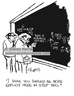
Many of you will be familiar with this cartoon, used in many texts on the use of Theories of Change
If you look at diagrammatic versions of Theories of Change you will see two type of graphic elements: nodes and links between the nodes. Nodes are always annotated, describing what is happening at this point in the process of change. But the links between nodes are typically not annotated with any explanatory text. Occasionally (10% of the time in the first 300 pages of Funnell and Rogers book on Purposeful Program Theory) the links might be of different types e.g. thick versus thin lines or dotted versus continuous lines. The links tell us there is a causal connection but rarely do they tell us what kind of causal connection is at work. In that respect the point of Sidney Harris's cartoon applies to a large majority of graphic representations of Theories of Change.

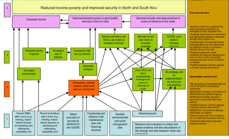
In fact there are two type of gaps that should be of concern. One is the nature of individual links between nodes. The other is how a given set of links converging on a node work as a group, or not, as it may be. Here is an example from the USAID Learning Lab web page. Look at the brown node in the centre, influenced by six other green events below it

 In this part of the diagram there are a number of possible ways of interpreting the causal relationships between the six green events underneath the brown event they all connect to:

The first set are binary possibilities, where the events are or are not important:

1. Some or all of these events are necessary for the brown event to occur.
2. Some of all of the events are sufficient for the brown event to occur
3. None of the events are necessary or sufficient but two or more of combinations of these are sufficient

The fourth is more continuous
4. The more of these events that are present (and the more of each of these) the more the brown event will be present
5. The relationship may not be linear, but exponential or s-shaped or more complex polynomial shapes (likely if there are feedback loops present)

These various possibilities have different implications for how this bit of the Theory of Change could be evaluated. Necessary or sufficient individual events will be relatively easy to test for. Finding combinations that are necessary or sufficient will be more challenging, because there potential many (2^5=32 in the above case). Likewise finding linear and other kinds of continuous relationships would require more sophisticated measurement. Michael Woolcock (2009) has written on the importance of thinking through what kinds of impact trajectories our various contextualised Theories of Change might suggest we will find in this area.

Of course the gaps I have pointed out are only one part of the larger graphic Theory of Change shown above. The brown event is itself only one of a number of inputs into other events shown further above, where the same question arises about how they variously combine.

So, it turns out that Sydney Harris's cartoon is really a gentle understatement of how much more we really need to specify before we can have an evaluable Theory of Change on our hands.

Tuesday, August 09, 2016

Three ways of thinking about linearity


Describing change in "linear" terms is seen as bad form these days. But what does this term linear mean? Or perhaps more usefully, what could it mean?

In its simplest sense it just means one thing happening after another, as in a Theory of Change that describes an Activity leading to an Output leading to an Outcome leading to an Impact. Until time machines are invented, we can't escape from this form of linearity.

Another perspective on linearity is captured by Michael Woolcock's 2009 paper on different kinds of impact trajectories. One of these is linear, where for every x increase in an output there is a y increase in impact. In a graph plotting outputs against impacts, the relationship appears as a straight line. Woolcock's point was that there are many other shaped relationships that can be seen in different development projects. Some might be upwardly curving, reflecting an exponential growth arising from the existence of some form of feedback loop, whereby increased impact facilitates increased outputs. Others may be must less ordered in their appearance as various contending social forces magnify and moderate a project's output to impact relationship, with the balance of their influences changing over time. Woolcock's main point, if I recall correctly, was that any attempt to analyse a project's impact has to give some thought to the expected shape of the impact trajectory, before it plans to collect and analyse evidence about the scale of impact and its causes.

The third perspective on linearity comes from computer and software design.Here the contrast is made between linear and parallel processing of data. With linear processing, all tasks are undertaken somewhere within a single sequence. With parallel processing many tasks are being undertaken at the same time, within different serial processes. The process of evolution is a classic example of parallel processing. Each organism in its interactions with its environment is testing out the viability of a new variant in the species' genome. In development projects parallel processing is also endemic, in the form of different communities receiving different packages of assistance, and then making different uses of those packages, with resulting differences in the outcomes they experience.

In evaluation oriented discussion of complexity thinking a lot of attention is given to unpredictability, arising from the non-linear nature of change over time, of the kind described by Woolcock. But it is important to note that there are various identifiable forms of change trajectories that lie in between simple linear trajectories and chaotic unpredictable trajectories. Evaluation planning needs to think carefully about the whole continuum of possibilities here.

The complexity discussion gives much less attention to the third view of non-linearity, where diversity is the most notable feature. Diversity can arise from both intentional and planned differences in project interventions but also from unplanned or unexpected responses to what may have been planned as standardized interventions. My experience suggests that all too often assumptions are made, at least tacitly, that interventions have been delivered in a standardized manner. If instead the default assumption was heterogeneity, then evaluation plans would need to spell out how this heterogeneity would be dealt with. If this is done then evaluations might become more effective in identifying "what works in what circumstances", including identifying localized innovations that had potential for wider application.


Saturday, July 16, 2016

EvalC3 - an Excel-based package of tools for exploring and evaluating complex causal configurations


Over the last few years I have been exposed to two different approaches to identifying and evaluating complex causal configurations within sets of data describing the attributes of projects and their outcomes. One is Qualitative Comparative Analysis (QCA) and the other is Predictive Analytics (and particularly Decision Tree algorithms). Both can work with binary data, which is easier to access than numerical data, but both require specialist software - which requires time and effort to learn how to use

In the last year I have spent some time and money, in association with a software company called Aptivate (Mark Skipper in particular) developing an Excel based package which will do many of the things that both of the above software packages can do, as well as provide some additional capacities that neither have.

This is called EvalC3, and is now available [free] to people who are interested to test it out, either using their own data and/or some example data sets that are available. The "manual" on how to use EvalC3 is a supporting website of the same name, found here: https://evalc3.net/  There is also a  short introductory video here.

Its purpose is to enable users: (a) to identify sets of project & context attributes which are  good predictors of the achievement of an outcome of interest,  (b) to compare and evaluate the performance of these predictive models, and (c) to identify relevant cases for follow-up within-case investigations to uncover any causal mechanisms at work.

The overall approach is based on the view that “association is a necessary but insufficient basis for a strong claim about causation, which is a more useful perspective than simply saying “correlation does not equal causation”.While the process involves systematic quantitative cross-case comparisons, its use should be informed by  within-case knowledge at both the pre-analysis planning and post-analysis interpretation stages.

The EvalC3 tools are organised in a work flow as shown below:


The selling points:


  • EvalC3 is free, and distributed under a Creative Commons Attribution-NonCommercial-ShareAlike 4.0 International License.
  • It uses Excel, which many people already have and know how to use
  • It uses binary data. Numerical data can be converted to binary but not the other way
  • It combines manual hypothesis testing with  algorithm based (i.e. automated) searches for good performing predictive models
  • There are four different algorithms that can be used
  • Prediction models can be saved and compared
  • There are case-selection strategies for follow-up case-comparisons to identify any casual mechanisms at work "underneath" the prediction models

If you would like to try using EvalC3 email rick.davies at gmail.com

Skype video support can be provided in some instances. i.e. if your application is of interest to me :-)

Monday, March 07, 2016

Why I am sick of (some) Evaluation Questions!


[Beginning of rant] Evaluation questions are are a cop out, and not only that, they are an expensive cop out. Donors commissioning evaluations should not be posing lists of sundry open ended questions about how their funded activities are working and or having an impact.

They should have at least some idea of what is working (or not) and they should be able to  articulate these ideas. Not only that, they should be willing, and even obliged, to use evaluations to test those claims. These guys are spending public monies, and the public hopefully expects that they have some idea about what they are doing i.e. what works. [voice of inner skeptic: they are constantly rotated through different jobs, so probably don't have much idea about what is working, at all]

If open ended evaluation questions were replaced by specific claims or hypotheses then evaluation efforts could be much more focused and in-depth, rather than broad ranging and shallow. And then we might have some progress in the accumulation of knowledge about what works.

The use of swathes of open ended evaluation questions also relates to the subject of institutional memory about what has worked in the past. The use of open ended questions suggests little has been retained from the past, OR is now deemed to be of any value. Alas and alack, all is lost, either way [end of rant]

Background: I am reviewing yet another inception report, which includes a lot of discussion about how evaluation questions will be developed. Some example questions being considered:
How can we value ecosystem goods and services and biodiversity?  

How does capacity building for better climate risk management at the institutional level
translate into positive changes in resilience

What are the links between protected/improved livelihoods and the resilience of people and communities, and what are the limits to livelihood-based approaches to improving resilience?